My name is Matt Hooper and I’m a relief printmaker working from my rather compact studio I built in the garden of my home in a town just outside Leeds. I’m a self taught artist and printmaker, ironically having being in the print industry for 32 years. I left school at 16 with no qualifications to speak of and went straight into a factory in Leeds in the reprographics department, believing this would be in some way artistic and creative.
How wrong I was! I spent the next three decades working first on film and photographic reprographics for the junk mail industry - bank and finance mailings, supermarkets flyers, charity circulars, basically all the things you hate to find on your doorstep.
I completed a seven year apprenticeship in film cutting and exposure in four colour repro, but the week after this apprenticeship was completed, the studio manager brought in a box containing… an Apple Macintosh computer. Those seven years were a complete waste of time!

So fast forward perhaps twenty years or so. Completely bored and unfulfilled, I noticed a friend post an odd thing online. I messaged him to ask what it was. He told me it was a thing called a ‘linocut print’. I bought a basic kit, had a go, and was instantly hooked.
I had always been a creative person, but failing my art GCSE was so crushing that I didn’t really do anything artistic for perhaps 32 years. But the moment I peeled off the paper from my first cut plate, all those artistic ambitions came flooding back.
I practiced, failed, succeeded, learned. The hunger to achieve a great print burned inside me and with each improvement and success I felt the growing fulfilment that my life had always lacked, the self worth and sense of achievement.
After three decades in print, I had finally discovered print. I spent every available moment outside of work making art and printing. It was so addictive. And then Covid-19 happened, a story familiar to everyone. And while the company I worked for managed to work through the pandemic by printing literature for the government, I did get 13 weeks of furlough which I spent printing. I went back to the factory for six months, but I knew I had changed. I had discovered what I needed to do. I quit.

I drifted for a month, then worked in a brewery, and the owner suggested a craft market once the restrictions had lifted. He asked me to run a print stall. I did this, sold some prints, and suddenly my hobby was supporting itself. Six months later, I left the brewery to make and sell my prints full time.
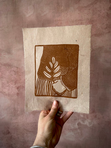
Linocut has always been described as naïve, a crude form of printmaking, lacking the dark arts of etching or mezzotint, or the noble history of woodcut and wood engraving. I questioned this, and decided to attempt to introduce fine lines, clean printing and a natural elegance to my prints. To do this, I studied Japanese woodblock printmaking; to discover the process and see if those skills could be transferred to linocut. They could.
Pouring over book after book, finding Japanese prints wherever I could, I examined the techniques, the tools and the paper. I slowly took what I could learn and applied it to my own printmaking, and wherever I couldn’t work something out, I invented my own methods. This rapidly gave my art it’s own look, a style which definitely tips the hat towards the Japanese but seen through the lens of a self-taught printmaker.
Without consciously meaning to, my art leans heavily towards the natural world. It is the forms in wildlife, flora and fauna that I find appealing. I enjoy the quiet observation of birds, trees, fish; the gleaning of a new detail, of the light and the shadow. As the Japanese Artist and Printmaker Hokusai said, "Look carefully, pay attention, notice. Keep looking, stay curious. There is no end to seeing."

Describe your printmaking process
I don’t consider myself particularly good at drawing, but I do consider myself a good observer. An observer of the subject, of where it fits in the world and perhaps therefore where it fits on the paper. Composition is incredibly important. I always create a new piece of work with the phrase ‘look, have you seen this?’ in mind. I’m showing people something. I don’t simply make a scene, it must contain something, even if that something is a feeling.
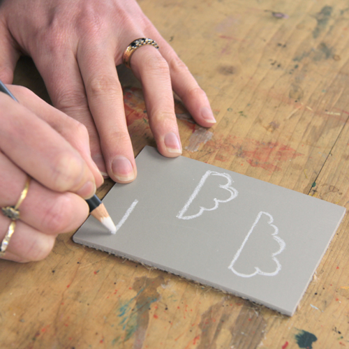
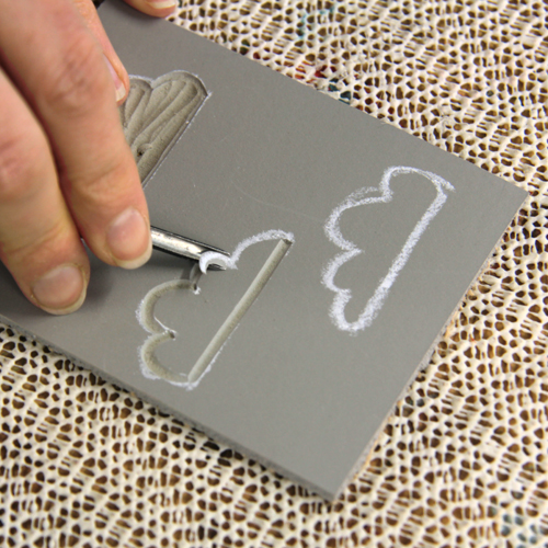
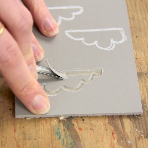
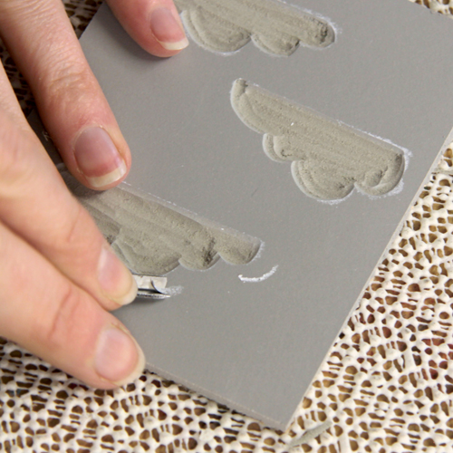
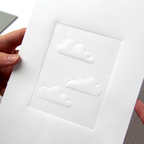
I sketch many small details; an eye, a limb, a wing, a tree. Never the full drawing. The final image only appears on the lino or on the wood plate. Even this has mistakes and overdrawing. The final distillation of the image is in the cutting. I make the big cuts, then smaller, and smaller; working down through the tools to the 0.5mm for those shallow featherlight cuts - which make the piece softer and more realistic.
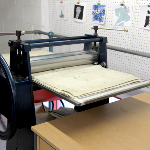
The printing is always the true art, in a way. The most overlooked part of the process. You can have a wonderful drawing, a delicately cut block, but if you slap on the ink and stick it through a press, all the work will be for nothing.
Because I worked so long with huge printing machines, I don’t use a press. Well, not a true press. I like my old bookbinding press when something needs a good deal of pressure, but every print gets the barren, every print usually feels the wooden spoon at some point. Just to be sure. Or perhaps I don’t feel like I’ve printed it until I’ve pressed it personally, felt the grain of the paper over the plate.
I don’t make any digital copies, no giclée. I’ve made millions of awful digital prints in my previous life, so why continue? I’m a printmaker, I make prints. I don’t pay someone to make my prints with a machine. I make them.

How and where did you learn to print?
As I mentioned above, I am self-taught. You could say I learned to print on the same dining room table where I fed my children, where we have had every Christmas dinner for the last twenty years. There’s still food stains from pureed mango on there, right next to a few more recent ink stains.
I learned from books mostly. Online articles too. But I am presently going through a diagnosis for adult ADHD, so my attention span is very limited when it comes to learning. I will often read an article on print and will be trying a technique before I’ve finished reading.
Practice is the biggest thing. Trusting myself, also. Looking at other prints tells me it can be done; looking at Japanese prints tells me the impossible is possible. So all I have to do is trust my instincts, think about how it might be done and have a go. It works surprisingly often.

Why printmaking?
I love drawing and painting but I am incredibly self-critical. I’ve never made a picture in this way that I liked or kept. As they say, a painting is never completed, only abandoned. You are always left dissatisfied, doubting. I think people are slightly mad when they are proud of a painting, like being pleased with a ship that is sinking. Look at what I abandoned! But that is because I look at paintings through my own lens, with so much self-doubt.
But there is a refining process with print. The sketches, the drawing on the plate, the change from pens to knives and chisels, the clean crisp cuts and the marks you make that never appear, if anything your cuts disappear. And then your print appears in reverse. It is a mirror, a strange reflection of your work, surprising and startling. You only see the art on its total completion. There is no abandonment, only acceptance or rejection. You like it or you do not. This is print, an image that is a distillation of ideas and toil, down to one final moment when you pull paper from plate.

Where do you work?
I worked for perhaps three years on my dining room table. I would hurriedly set up my print studio on there in the afternoons or mornings depending on my work shift patterns. My fourteen stone nipping press would be hauled up from its corner onto the table, then hurriedly put away when dinner was served whilst trying not to put my back out.
Now I work in a tiny garden studio I built myself. We moved house into a place with nowhere for me to work, and a very steep garden. I dug out the whole garden, built a terrace, and then built a studio on there. It’s far too small but I make it work. Some people have no dedicated art space so I am lucky, and it sure beats lifting my press on and off the dining room table.

Describe a typical day in your studio.
There is no typical day, and that’s why I love printmaking. If I am drawing, it begins with music. Nothing with lyrics, just ambient sounds. I research images, make sketches, work on shadows. Nothing too big, nothing complete. More ideas and forms and feelings.
Cutting plates is my favourite thing. I listen to podcasts and audiobooks. Due to what I think is ADHD, I get hyperfocus. I go into something similar to a trance, a flow state, focussed totally on the task for perhaps 10 hours at a time. I am consumed by a block. I can’t print, I can’t draw, I have to cut. I love it.
I work with tools in front of me and a sharpening station to my right, so if a tool feels even slightly blunt I can quickly hone then continue. These days I need a magnifying headset with a choice of lenses. The joy of ageing, even though it definitely is a privilege. Printing days are much more physical.
I prepare paper, dampen if necessary then stack to dry off slightly. Then I clear my workstation, lay out covers and prepare my boards on which I print with Ternes Burton pins, and lay out glass plates for ink mixing.
I prep my inks, mix to the correct colours, make sure all plates I need that day are to hand, and get printing. I stack prints on a drying rack beneath my table. It has ten layers but then I transfer these to a bigger rack in the living room in the house. Needs must. I listen to much livelier music, usually rock music when printing. AC/DC!

How long have you been printmaking?
Eight years as an art printmaker, three years full time, but 32 years previous to that in the print factory. There is obviously some crossover here, I was learning good print while still doing bad print!
What inspires you?
Firstly, nature. I can be driving at dawn to an event somewhere miles away and suddenly see a sunrise, a bird gliding or a deer bounding over a field and think, oooh…. That would make a fine print!
Secondly, other printmakers. I would urge any aspiring printmakers to go to local print fairs and just look at the work of others. There’s some incredible work going on right now, printmaking is riding a beautiful wave and it’s a brilliant time to be involved in the art form.

What is your favourite printmaking product?
Mitsumata Washi. What a paper! It’s not right for all my prints but for some it’s the only paper I will use. It’s beautiful, soft and strong. I holds the light. A notable mention is the Japanese tools stocked by Handprinted. Proper tool porn. It’s fantastic that you can buy such fine Japanese tools from a shop in the UK and they arrive at your door perhaps two days later, It’s a dream.

What have you made that you are most proud of?
The honest answer is… progress. It isn’t any one piece of work. My favourite piece of work is the one I haven’t done yet. Ian Fleming wrote that James Bond’s favourite drink of the day was the drink he thought about before his first drink of the day. That’s the print I think about. I like thinking about print. Imagining how it will turn out, what I can do to make it work. I turn it over in my head like a Rubik’s Cube. This puzzling is a great joy to me, it occupies an over busy mind.
I am improving as a printmaker so this progress is hugely satisfying. I’ll never get where I want to be, make that print that I dream of, but this is a comfort. It’s never going to end. To gamers, imagine the perfect game that won’t end. You get to play it forever.

Where can we see your work? Where do you sell?
My work is in the wonderful Yorkshire Gallery in the Piece Hall, Halifax, a genuinely superb gallery who work so hard for their artists, and at the Leeds Art Gallery shop, the Craft Centre and also on my own website.
You will often find me selling my work at art shows, print shows, craft fairs and artisan markets across the north of England every weekend. I make art five days a week, I sell it two days a week. Days off? What would I do on a day off? I would be printing!!

What will we be seeing from you next?
I have a show at Leeds Art Gallery Craft Centre from October through to January, I will be at events every weekend from now to Christmas and beyond but check out my Instagram to find out exactly where I’ll be.

Do you have any advice for other printmakers and creatives?
Experiment. So many trained fine artists find themselves in a rut because they keep doing the same single thing a lecturer once told them they were good at, so they repeat the same thing over and over. Try something new! Paint with your fingers! If you do landscapes, do a pig. If you specialise in architecture then try water. Get out of your comfort zone, because in reality there is nothing comfortable about a comfort zone. Grow! If you’re new to art… make some art. Try it all out. Enjoy it. But try printmaking because if you get half the fun I get out of it then you’ll have a ton of fun.
Buy a kit, experiment. Maybe take a class. Make art with friends. Make art on your own. Don’t let anyone tell you that you cannot make art, that you will never be an artist. I was told that for decades and I’m an artist. If I can, then you can.
To see more from Matt, follow him on Instagram!
]]>