
Fabric Painting - which fabric paint is right for my project?
When it comes to painting onto fabric, there are a few differences to consider. Does the paint need to be opaque? Can it be diluted? Would you like metallics? Aimee has tested three different fabric paints: Jacquard Textile Colour, Lumiere Metallic Paint and Handprinted Fabric Paint. We have experimented with painting onto light and dark fabric.

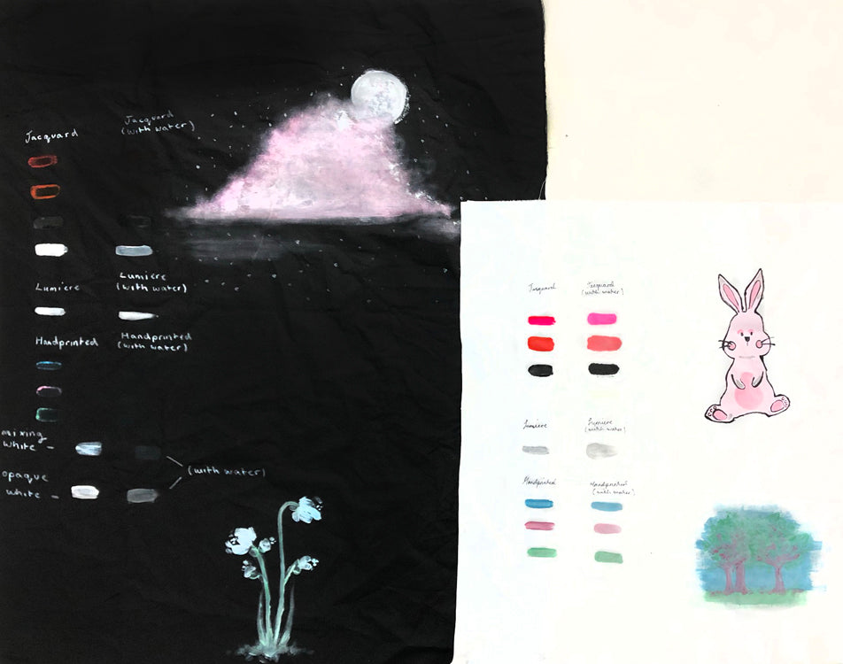
First, painted onto white cotton. We first experimented with Jacquard Textile Colour using Florescent Pink, Scarlet, Black, and Super Opaque White. We found that the Jacquard Fabric Paint held a lot of pigment, is quite opaque and feels thick to paint with.
After adding a few drops of water to the Jacquard Textile Colour they became thinner and therefore much easier to paint with. It's worth noting, however, that the edges of where the paint sat started to blur slightly when it was mixed with water.
We tested Handprinted Fabric Paints in a pastel colour scheme of Dusky Pink, Sea Green, Cloudy Blue, Mixing White, and Opaque White. These fabric paints are thinner than Jacquard's, making them more fluid to paint with, with less paint clumping on the brush. Handprinted Fabric Paint also held a strong pigment but was not as opaque as Jacquard. After adding water we noticed that like Jacquards, the edges of where the paint sat starts to blur a little.

Lumiere are metallic fabric paints. We tested silver but they come in a large range of metallic shades. They are quite thick, like the Jacquard Textile Colour, with a soft shimmer. After adding a few drops of water to the paint, we saw that it became much more shimmery but adding water caused the water to separate from the metallic pigment slightly, causing a watermark stain around the painted line.

We used Jacquard Textile Colour on black cotton. The standard colours are too translucent to show well on the black, but the Opaque White showed up extremely well. The standard colours made a ring of paint around the brushstroke, where the paint was thicker. After adding water to the paint, all the paints were barely visible apart from the Opaque White, which became a pale grey on the black fabric.
Using Handprinted Fabric Paint, both Mixing White and Opaque White showed up well on black fabric, but the Opaque White was a brighter white and the Mixing White turned grey. The standard colours are too translucent to slow up. After adding water to the paint these colours did not show up at all. The Mixing White was still visible but very faded and the Opaque White was still visible but, similarly to the Jacquard's Opaque White, it turned out grey. For painting colours onto dark fabric, mixing the colours with the Opaque White is a great option.

The Lumiere works beautifully on dark fabric - even better than on the white fabric. We found that the Lumiere looked more shimmery and metallically on the darker fabric, and when we added water it only became more shiny! It was easier to paint onto fabric after adding water. As well as this, there was no stain around the paint like there was on our previous experiment onto light fabric, which is a bonus.

All of these fabric paints are fun to work with. They all need heat setting with an iron to become washable. What will you use for your project?