How Much Detail on Exposed Screens?

When designing artwork for exposed screens it can be very difficult to figure out what level of detail you can include. Different mesh counts will be able to handle different levels of detail.
The mesh number relates to how many threads there are per cm of mesh: 32T has 32 threads per cm, 120T has 120 threads per cm etc. Ideally, 43T mesh is used for printing onto fabric and 90T is used for printing onto paper. We’ve put together a quick test to see what detail can be achieved on our two most common meshes: 43T and 90T.

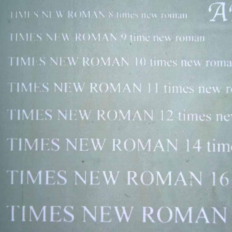
We are often asked which font sizes are appropriate for each mesh but this is tricky to answer as different fonts come out at varied sizes and some have thicker and thinner parts to the lettering. For this test we’ve used Calibri (a plain sans serif font) Time New Roman (a serif font) and Apple Chancery (a calligraphy style font with thinner strokes) in sizes 8 to 22.
The same sheet of samples was exposed onto a 43T and 90T screen. Scroll down to see the results of our prints with these screens.
For prints on fabric we have used Speedball Fabric Screen Printing Ink in black. For prints on paper we have used Speedball Acrylic Screen Printing Ink in black. These are both standard inks – opaque inks and metallic inks will be harder to force through the ink and block the mesh faster and are therefore more suited to higher mesh count and less fine detail.

Some of the areas have been halftoned through our rip software which turns grey areas into dots to give the illusion of tone.
43T Mesh onto Fabric
We’re losing the detail on the font up until about size 14. The lettering on the right has been drawn with a 6px brush into Photoshop.

90T Mesh onto Fabric
90T mesh is not ideal for printing onto fabric as it puts down a lighter deposit of ink than a 43T. The prints can therefore appear paler and less bold. We’ve got more detail here on the smaller font sizes but it’s not printing very well on the weave of the cotton – this print has also smudged!

43T Mesh on Paper
We’re still losing the detail up until font size 14. It’s putting down quite a heavy deposit of ink so it’s starting to blob a little in places with tiny
detail.

90T Mesh on Paper
We’ve managed to get most of the detail in the size 8 font here, although this small size may start to dry fast so quick printing is a must!

43T Mesh on Fabric
This type of Font is a real problem on more open meshes as it has very thin areas that don’t expose well at all.

90T Mesh on Fabric
We’ve got more detail but the font still isn’t great up until size 14. The 90T mesh also isn’t printing this evenly on the weave of the cloth.

43T Mesh on Paper
On paper it’s easier to see the areas where the font is too fine for a 43T mesh.

90T Mesh on Paper
It’s much clearer on a 90T mesh but we’re still missing the finest areas.

43T Mesh on Fabric
This font hasn’t exposed properly until about size 16.

90T Mesh on Fabric
The tiny serif lines are starting to show more but struggling to print on the fabric.

43T Mesh on Paper
We’ve lost some of the serif detail which isn’t clear until size 14.

90T Mesh on Paper
We’re getting good results from size 14 with legible results from size 12. These fine lines will dry ink quite quickly.

43T Mesh on Fabric
Lines close together create vulnerable areas of emulsion and on more open meshes these areas will start to meld together. More may disappear as it’s printed
and washed.

90T Mesh on Fabric
We’ve got much clearer paces between the lines

43T Mesh on Paper

90T Mesh on Paper

43T Mesh on Fabric
The lines that are 1 pixel, 2 pixels and 3 pixels wide don’t come out on the screen at all. The 4 pixel wide line is faint and patchy.

90T Mesh on Fabric
We’ve got an extra line on this mesh – the 4 pixel line is clear and the 3 pixel line is faint and patchy.

43T Mesh on Paper

90T Mesh on Paper

43T Mesh on Fabric
Here we’ve created a gradient halftone through our rip software. The 43T mesh has given a grid distortion making the tone uneven.

90T Mesh on Fabric
On a 90T mesh the halftone is much more even with more detail as we go further down

43T Mesh on Paper

90T Mesh on Paper

43T Mesh on Fabric
The grid pattern is prominent on this mesh give a moire effect. The palest grey halftone is barely there.

90T Mesh on Fabric
The tone is much more even and we have much more detail on the palest tone.

43T Mesh on Paper

90T Mesh on Paper

Order your own custom exposed screen here!
