Meet the Maker: Ian ‘SWIFTY’ Swift

Even if you have never heard of Swifty you will probably have seen or even owned a piece of his artwork. In the late 80s he was plucked straight from art school in Manchester by Neville Brody to work on The Face – the most influential magazine for music and graphic design. He has worked for record labels like Gilles Peterson’s Talking Loud and James Lavelle’s Mo Wax, designed TV titles such as Smack the Pony and Peep Show, was the art director of Straight No Chaser magazine, designs Fonts, club night flyers, T-shirt designs and skateboards.
Swifty’s is a very hands on graphic designer – equally at home with a Rotring pen and a stack of paper to designing in Photoshop. To create his iconic artworks he mixes up to the minute design tools with lo-fi production techniques.

Describe your process.
My process has been refined over a period of about 30 years. Even though I was at the forefront of digital technology being one of the first graphic designers in the UK to adopt and use Apple Macintosh computers I still adopt a very hand drawn analogue approach.
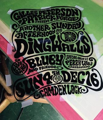
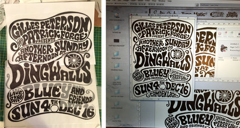
Yes the computer will always be used as the tool of choice but my tools are still very much pencils and marker pens. Original type is drawn by hand and then scanned. A Photoshop file is generated at the right size and I print a positive heavy black print onto OHP inkjet film.

Handprinted have been instrumental in helping me develop my process which is all in house and very lo-fi. I use aluminium screens in a 55T mesh – this grade works best for me, giving me the right amount of detail and the aluminium frames stand up to the elements as most of them are stored outside in the garden. I have found that the 55T grade mesh works best for me giving me the right amount of detail. After coating the mesh with Speedball Photo Emulsion I leave it in my shed/studio overnight in the dark to dry thoroughly.

First thing in the morning I set up for exposing which is about as basic as it gets. I have an old 60’s photographic light with the biggest traditional bulb of about 500 watts which exposes the screens in a range from 22-27 minutes depending on how old the emulsion is. I print the positive film printed off on my Epsom 1400 inkjet which provides a really good positive black similar to and old fashioned Bromide or film positive. After exposure I wash out the emulsion in our family bathroom.

My set up is very simple – just hinge clamps on a wooden table, prints are hung to dry, on a makeshift drying line with clothes pegs in the shed and when that’s full up and it’s a nice day on the washing line outside.

How and where did you learn to print?
I learnt to print on my foundation course aged 16-17 at Padgate Art College near Warrington, Merseyside. I was immediately drawn to the silk screen process in particular and then discovered the work of Andy Warhol which sealed my interest in the print form and ways of reproducing multiples in any medium. After pursuing a career in graphic design I didn’t then silk screen print properly for about 30 years. I then taught myself how to produce an edition starting from scratch and the golden rule was I couldn’t outsource any part of the process apart from buying the materials and ink needed, I had to be self sufficient.

Why printing?
So I can produce editions primarily. Rather than spend a fortune outsourcing the prints I prefer to print myself. Not only for the obvious cost reasons but because the act of printing is such a joyous one. Every print is hand pulled by myself and I like the slight imperfections and accidents that occur.
Where do you work?
My studio is in a small shed at the end of my garden in West London. It’s the smallest studio I’ve operated out of but in some ways the best because I have customised the layout several times to a point now were every available space is used to the maximum – small space working is very exciting when you have everything just how you want it – ‘were there’s a will there’s a way’!
Describe a typical day in your studio.
As varied as possible, not every day will I be printing: only when I have a new edition connected to say ‘Dingwalls’ (the bi yearly jazz Dance event my partner Janine organises) or for the ‘Art Car boot Fair’ (another yearly event in the diary I always produce a new edition). Not only silk screen printing but lino cuts, stencils and spray paint etc. I often mix the mediums on one print. Usually my days are still spent designing logos, record covers, fonts and magazines for my usual clients in the music industry. Very occasionally I design the odd title sequence for TV or I might be planning and producing bits of art for a gallery show. No two days or even weeks or a month is ever the same. I’m blessed to have a rich and varied client base who come to me for all sorts of stuff. It’s that variety that keeps me going most of the time.
How long have you been printmaking?
Since I retaught myself – about 10 years now. Silk screen is my preferred medium but I still do the odd mono print or etching. And I do have a range of inkjet prints called the ‘Swifty Jazz festival’ which are very popular. That’s not the same as a proper print but it does make them cheap which is part of their appeal.
What inspires you?
Everything from Saul Bass title sequences to Reid Miles Blue Note record covers, Charles Eames furniture to Brutalist architecture – the list is endless and it changes with the mood. I just saw the Rauchenberg exhibition at the Tate so that’s big on my mind at the moment. He’s another great artist who adopted the silk screen medium and produced some amazing work right through to his transfer paintings of late, another technique I am very interested in. Inspiration has to be a constant and us creatives need to constantly discover new stuff to keep us inspired.
What products do you use? What product/tool could you not be without?
One stop shopping at Handprinted! They give great advice about screens and new products. Speedball is my favourite ink for both t-shirt and paper printing, I recently had fun with some of the fluorescent inks.
My aluminium screens, hinge clamps, squeegees, everything comes from Handprinted. Although my 60’s photographic lamp is the one bit of kit that I couldn’t do without, bought on Portobello Road market well over twenty years ago.

What have you made that you are most proud of?
Oh that’s a tough one, I’ve got a couple of camouflage paintings which I’m pretty fond of but in terms of printing some of the editions for ‘Dingwalls’ I think are very classic Swifty designs. But of course I’m still proud to have designed some great logos for the likes of ‘Talkin’Loud’ or ‘Mo Wax’ and my font designs like ‘Coltrane’ or ‘Gunshot’ are works that people still resonate with over 20 years later.
Where can we see your work? Where do you sell?
My website for general info and portfolio (needs a lot of work!) I sell prints and other bits on my Big Cartel shop.
My monograph book – ‘Swifty: Funky Typografix’ is available from the Gamma Proforma website.

What will we be seeing from you next?
Lots more editions with a bit of luck – time to delve into the archives and pull out some gems!
Do you have any advice for other printmakers and creatives?
Never stop.
